test heading
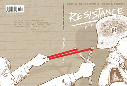
I’ve always been a big fan of wrap-around covers. I have a habit that whenever I get a new book I always take off the cover and open it flat, look at the case, look at the spine…see it the way the designer did on screen, flaps out, all of the pieces together…a visual conversation of the whole package.
When Leland Purvis sent along a thumbnail concept of this great art for RESISTANCE, BOOK 1 (a SPRING 10 book written by Carla Jablonski, with some pretty incredible art by Leland telling the story) our entire floor was buzzing over it. Playful, strong, and sets the tone of the series which chronicles the French Resistance during WWII and the children who got involved in the fight.
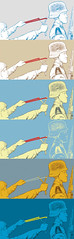
Realistic coloring wouldn’t have made the cover as strong so I started to play around, inspired by the palette of the book which is a lot of beautiful blues and browns. I made over 20 until I had pushed myself too far. Got to the point of “world’s ugliest color scheme” and then worked my way back. (You guys don’t get to see THAT one, though I blame that fourth one down in the image on the left on me watching GHOST DAD earlier that week. NOTE TO OTHER DESIGNERS: Don’t watch Bill Cosby movies and design at the same time. Listen to someone who learned the hard way.) After all the variations, I realized I had been on the right track in the beginning. Something quiet so a shock of red for the band would be impossible to ignore.
But it still felt too static and flat for a story with so much action, spying, running, disguises, and danger. It wasn’t working, so I decided to add some texture. Sure I could have made fake bricks in photoshop or thrown a simple filter in, but what fun is that?! This was an excuse for a Texture Field Trip!
If you live in NYC and haven’t yet become a wanderer, you’re doing it wrong. I could argue it’s the greatest place in the world for people watching…and texture hunting. A few hours of walking around NY and brooklyn and I had over 60 new textures on my camera. I’m a firm believer you should always have a camera on you, especially if you are a designer or tend to run into Hulk Hogan a lot. (I swear that guy is stalking me.) There’s just something so beautiful about naturally aged architecture, broken concrete, bricks who have seen a lot of things…though if they could talk, I’m not sure I’d want to hear the stories. That first wall below was stunning close-up. The picture didn’t do it any justice.
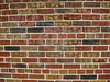
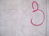
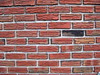
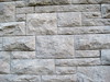
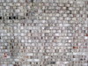
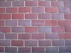
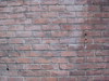
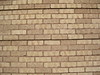
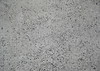
Can you spot the winner? Click on any for larger versions and feel free to use them, since it will give me an excuse to go on another Texture Field trip in the future. Though honestly…wouldn’t you rather go hunting yourself? There’s a lot of beauty if you look around you a bit and everything can be a texture if you use it right.
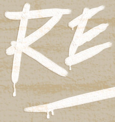
I didn’t want the wall to look like a photograph in the end and I definitely didn’t want it to overpower the art. I’m really happy with how it turned out and proud to have this as my second :01 design. Despite the fact I am constantly drooling over fonts, I’ve gotten really into hand-lettering lately. (Note if you are a fontophile and don’t subscribe to these newsletters you are missing out.) But there’s just something about hand-lettering that makes me connect more emotionally with a book. This is definitely not a light book. Sure there are funny and sweet moments, but it’s dark, real, and inspirational. Creating the logo by hand made me feel connected with the kids in the story. My own attempt to say “take that” against the oppression France faced during the dark times of their Nazi occupation.
Wonderful post colleen, you did the whole Ph.D.