test heading
When it comes to design, spines don’t often get much credit. People will rant or rave over covers, but it’s pretty rare to hear a “DID YOU SEE THAT BOOK SPINE?!” or “I was going to read that book, but I just couldn’t get over the ugly spine.” The spine is one of the trickiest design elements, such a small amount of space and such a big job. Often times spines are all you see of a book. You can have the greatest cover in the world, but if you have a weak spine, no one is going to notice it on a crowded shelf.
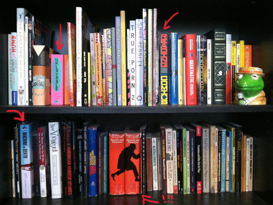
Over the years I’ve become more aware of spines, surrounded by them constantly. I’m pretty sure my office has walls, but there are too many books in the way to confirm it. When I glance quickly the same books pop out at me over and over again. Douglas Wolk’s READING COMICS, the MACHINE OF DEATH Vol. 1 edited by David Malki !, Matthew Bennardo, and Ryan North, the super sparkly UNLOVABLE by Esther Pearl Watson. I even started to buy books just for their spines. The red “creeping detective” spines you see above are gems found at Raconteur Books. Surprisingly, the stunning design comes from two mystery story collections that Reader’s Digest put out. Yup that’s right, Reader’s Digest. Take that all you literary snobs! I like my pretty design in all forms.
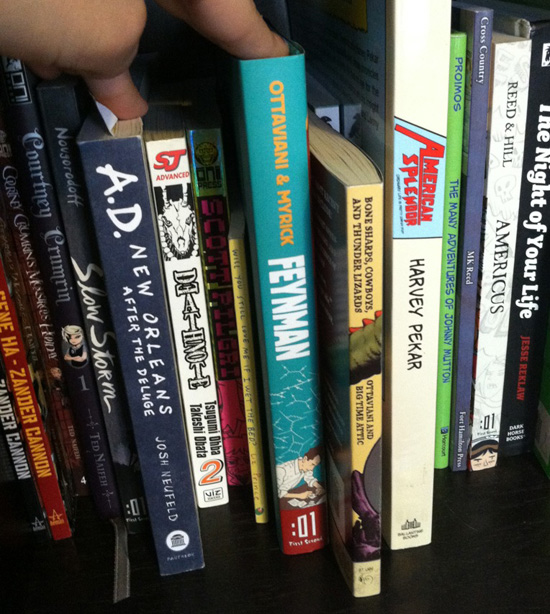
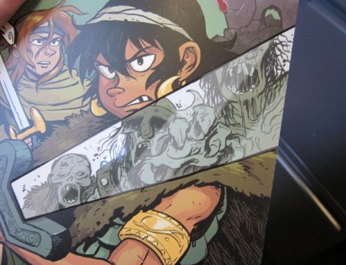
Speaking of books you’ve PROBABLY never heard of. There’s this one called WATCHMEN by…some guy…Alex….Adam…eh something like that. I know people always talk about the genius inside, but seriously that spine! So striking, so hard to miss. It’s simple, iconic, using every single millimeter the spine width allows (I can hear my production person, Alexa [no relation to Alan], get nervous just by me writing this.) A spine without much breathing room leaves a lot of room for slight printing mistakes, but the they left JUST the right amount to allow for subtle cover shifts in the binding process. Other spines of note! Matt Kindt’s SUPERSPY with it’s crooked handmade letters always jumps out at me. Those eye-catching stripes on Nicholas Gurewitch’s PERRY BIBLE FELLOWSHIP collection. And HEY LOOK AT THAT! It’s FEYNMAN. FEYNMAN by Jim Ottaviani and Leland Myrick was the first hardcover I ever designed, and when I saw the template for the spine width I practically started break-dancing on my desk. (NOTE: I can’t actually break-dance. DOUBLE NOTE: If my desk had not been so messy I think it would have happened.) I went with a bold color scheme, teal and orange and red, with Feynman’s own equations working as a wallpaper pattern, floating up from him hard at work.
Since I kept lending my copy to friends who swear they “don’t like comics” (which I just translate to “they’ve never even TRIED to read comics”) I had to head over to Calista’s bookshelves to get a picture of what I consider the most iconic book spine in all of Comic Land.
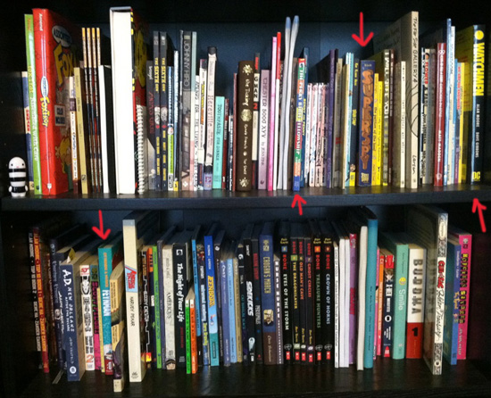
BLANKETS by Craig Thompson. It’s impossible to miss on a shelf. It’s huge, beautiful, simple in colors but works both the vertical and horizontal planes. The handwritten text invites you into the trees and into the story inside. Also of note on her shelves, the new SCOTT PILGRIM editions compared to the original editions. CLASSIC FEYNMAN, a spine that gets a LOT of text in while still being as charming as Feynman himself. (Is there something about that man that inspires great spines?!) Aaron Renier’s SPIRAL-BOUND—made to look like the side of a spiral notebook, complete with a pencil shoved into the fake metal coils. LOVE. I also marked FUN HOME by Alison Bechdel, which has the most beautiful blue foil. This is an example of a spine that pictures do no justice. You have to walk by it in a room and watch it light up at just the right moment to see how stunning it is.
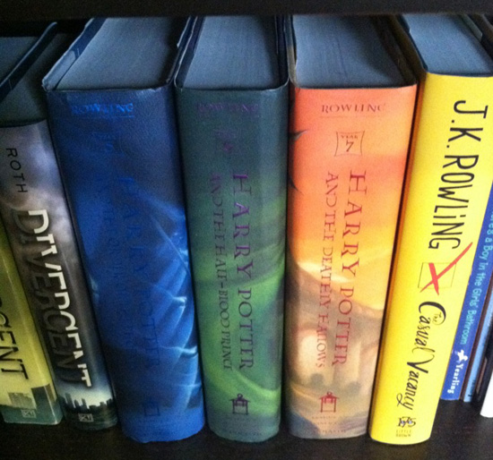
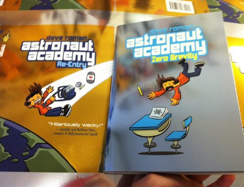
Every time we sign up a book that’s over 200 pages, yes I will admit I get crazy happy. Sure it’ll mean an extra few weeks of interior work, but it’s all worth it because I GET AN EXTRA .25″ or .5″ of a SPINE!!! WOOO! Larger spine means more possibilities, look at Blankets! If it had been a 124 page paperback it wouldn’t have nearly the same impact, but not all designs work at all widths and JUST having a big spine doesn’t mean you are going to have a great spine. Example: HARRY POTTER BOOK 5, HARRY POTTER AND THE DISAPPEARING SPINE TEXT. (Though I should note, I love you J.K. and that’s totally my favorite of the 7. Awkward puberty for the win!)
Small spines can be amazing as well. As an exercise let’s look at some of our publishing friends: The picture book spines! Picture books, usually 32 pages (occasionally 48-64), have a very limited space for spine art.
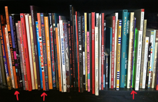
Looking at my shelves I squinted my eyes and picked out the first three that jumped out at me: CREEPY CARROTS by Aaron Reynolds and Peter Brown, OLIVIA by Ian Falconer, and Shel Silverstein’s THE GIVING TREE. CREEPY CARROTS just got a Caldecott Honor. The letters are slightly different shade of orange, with nervous sketchy writing for the author/illustrator names. Even they are afraid of the carrots in this book! OLIVIA succeeds not only because of the bold vertical lettering and stars, but the color of the spine is really unique, it’s not quite a red. It’s definitely not an orange. It’s playful and different, just like Olivia herself. THE GIVING TREE is iconic partially because most of you reading this post have seen it your entire lives, but it’s the green that makes it stand out so much. It’s not neon, but it’s certainly not a green you see every day. That combined with the hand-drawn text and the slight bit of the tree’s branches that sneak onto the front of the spine make it so unforgettable.
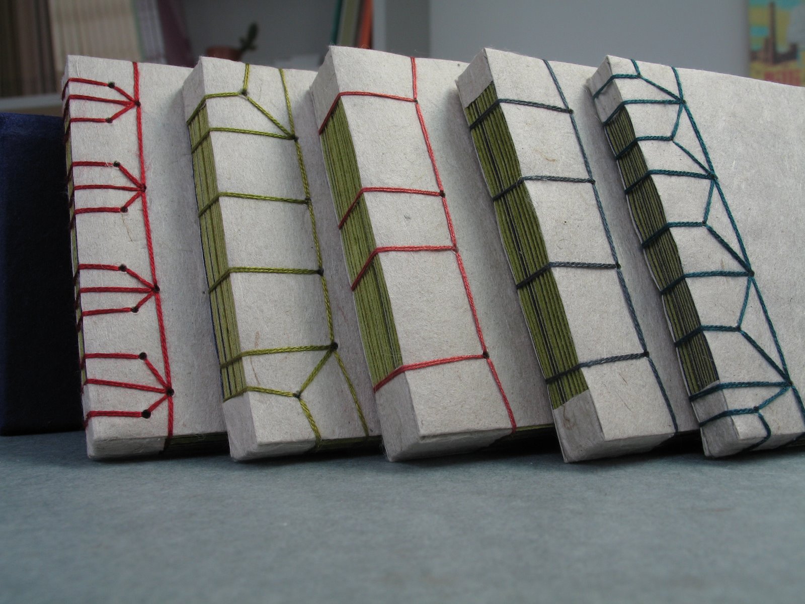
So what makes a great spine? Is there a formula? A checklist you can follow? Like all things in design, it’s just one piece that holds together the rest of the package. I could say a spine needs to be READABLE, BOLD, and ICONIC, but really what a spine needs to do is to feel one with the book inside and to highlight its story or its art or its charm. I came from the land of mini-comics. Hand-sewing and stapling my own books for years. My first spine was created with a bone folder. 98 pages of comics printed on the cheap photocopy paper, hand-sewn in two signatures. The spine was so tiny I couldn’t even fit words so instead I made a pattern with the binding thread, three small braids, dipping in and out of the pages underneath. I don’t even have any pictures of it, because after a week of sewing I only was able to finish 12 copies and they all sold at my first convention. It was preeeetty rough, though my warping brain likes to imagine it was somehow an intricate Japanese style binding worthy of a glowing place in my memory. What it did make me realize was all of the possibilities that are between the front cover and the back cover of a book. There’s a whole lot you can do with a spine. I’m thankful I get to design them every day now.
QUESTION: What are some of your favorite book spines?