test heading
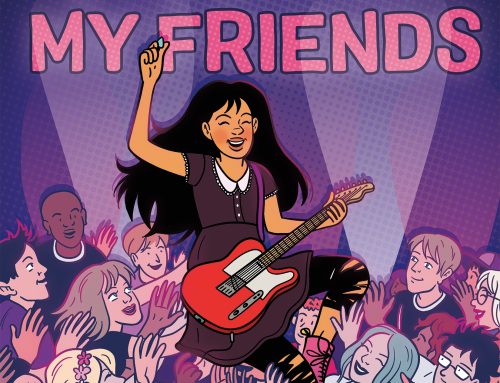
I love the covers for this trilogy. Mark (our esteemed Editorial Director) designed them himself, pulling artwork from the interiors and having it colored.
(My favorite part of that process was watching Mark get two different color samples, combine the two files, and somehow come up with something perfect that was halfway between the two options. Photoshop being a complete mystery to me, this was like magic!)
(This is what the Korean covers look like. Also pretty, but a totally different style!)

I have not seen korean editors for a while. Really like this one, maybe will find it buy it. Cuz this piece is so asian. Dont lose the tradition anytime any way.
the usa one looks like another coloring page cover that some us manga companies/editors are so fond of. the kind of fanart that you find on deviantart done by middle school kids. this editor must be afraid of open space.
the korean looks more like traditional korean art and design.
not totally knocking the usa one (i understand the marketing ploy to stand out more), but honestly, why spend 5 minutes coloring a manga page when you’ve got a decent actual artist who already designed the book elegantly for you?
my 2-cents.